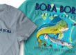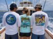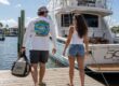
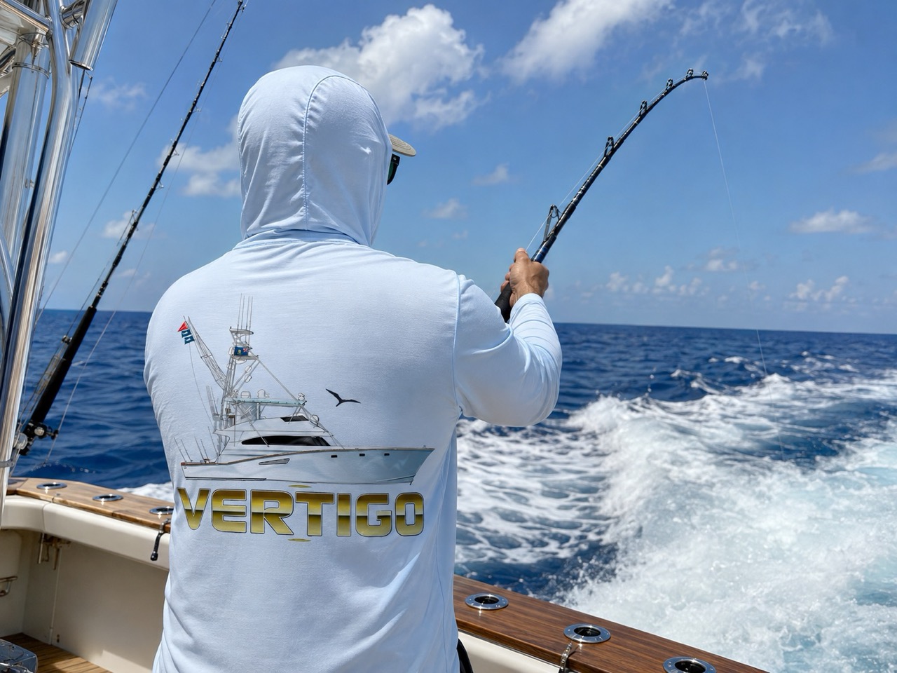
A custom boating shirt design stands out when it has one clear focal point, enough value contrast between the ink and the garment to read from thirty feet away, and typography sized for distance rather than for a laptop screen. Everything else is refinement. Those three things decide whether people notice the shirt from the next slip over or walk right past it.
Here is the uncomfortable truth about apparel design. Most shirts fail not because the artwork is bad, but because it was judged at the wrong distance. On a monitor, the design sits twenty inches from your face at full brightness. At the marina, it is seen across a parking lot, in glare, on a moving person. Designs that survive that transition follow a specific set of rules.
What Makes a Custom Boating Shirt Design Stand Out?
A custom boating shirt design stands out through hierarchy, contrast and restraint. The eye needs one thing to land on first, a clear path to the second element, and nothing competing for third place. Shirts that try to say everything end up saying nothing.
The elements that consistently separate memorable marine apparel from forgettable apparel:
- A single dominant element, usually a gamefish illustration, a vessel portrait or the boat name in custom lettering
- High value contrast between the graphic and the garment color
- Typography built for distance, with thick strokes and generous letter spacing
- Deliberate negative space so the design has room to breathe
- A limited palette, typically two to four colors, that reads as intentional
- Small personal details placed as secondary information rather than competing for attention
Those six show up in almost every shirt that people keep wearing for years. Miss the first two and the rest cannot save it.
Contrast Is the Element That Decides Everything Else
Contrast is the first filter, and it is measurable. Design guidance across the apparel printing industry converges on a practical benchmark: maintain at least a 40% difference in value, meaning lightness versus darkness, between the garment color and the ink color.
Navy ink on a black shirt fails that test. So does white on light blue, cream on white, and pale yellow on heather gray. The highest contrast pairings available are white ink on black and black ink on white, which is exactly why they never go out of use for team and event apparel.
Environment matters too. Outdoor light under a midday sun softens perceived edges and reduces sharpness, so designs meant for the dock need bolder separation than designs meant for a showroom. A palette that looks refined indoors can go muddy on the water.
For marine work specifically, a few pairings do heavy lifting:
- White or bone ink on navy, charcoal or deep teal
- Deep navy or black ink on natural, sand or heather gray
- Saturated orange, coral or chartreuse as a 10% accent against a dark base
- Faded, tonal treatments only when the shirt is meant to feel understated rather than loud
A useful ratio to work from is 60-30-10: 60% garment color, 30% primary ink, 10% accent. It keeps a design from turning into a color argument. Studios that build marine apparel artwork as a specialty tend to lock the palette before the illustration is finished, because the color decision constrains everything downstream.
Typography: The Boat Name Has to Read From the Dock
Boat name lettering is the most commonly botched element on custom marine apparel. It is treated as text when it should be treated as artwork.
Custom lettering built specifically for the name almost always outperforms a font pulled from a dropdown. The reason is proportion. A stock script chosen at 40 points on screen becomes a thin, illegible smear at 12 inches wide on fabric, because stroke weight does not scale the way people expect.
Practical rules that hold up:
- Thicker strokes survive distance. Hairline serifs and thin scripts disappear first.
- Letter spacing needs to open up as the print gets larger, not tighten.
- All caps reads faster at distance than mixed case for short names.
- Outlines and drop shadows help on busy backgrounds, but only one effect, not three.
- Match the transom. If the boat already has lettering, the shirt should echo it.
That last point is what turns a shirt into part of the boat’s identity rather than a separate souvenir. A design studio that also handles boat graphics, lettering and marine branding can carry one letterform across the transom, the decals, the hats and the apparel so everything reads as a single identity.
Illustration Style Sets the Personality
The illustration style communicates who the boat is before anyone reads a word. Three approaches dominate marine apparel, and each sends a different signal.
Detailed Gamefish and Vessel Art
Realistic illustration works when the audience knows the subject. Anglers notice whether a sailfish bill is the right length, whether the mahi has the correct forehead profile on a bull versus a cow, and whether the boat drawn is actually a center console rather than a generic silhouette.
This style suits offshore boats, sportfishing yachts and serious fishing programs. It also demands more from production, because fine detail and gradients need a print method that can hold them. Studios with real marine illustration depth, such as BoldWater, get the anatomy right because the audience will catch it if they do not.
Line Art and Single-Color Marks
Line art is the most versatile option and the most forgiving in production. A clean single-color vessel profile or species outline scales cleanly from a full back print down to a left chest mark, an embroidered hat and a decal.
For a family boat or a private owner who wants one identity reused across multiple items, line art is usually the better investment. It costs less to print, survives more decoration methods, and does not date as quickly.
Vintage, Distressed and Chart-Inspired
Distressed textures, halftone patterns and bathymetric chart motifs give a shirt a lived-in feel. Depth contours from a real fishing spot, coordinates of a home port and old-school badge layouts all land well with this treatment.
The risk is legibility. Heavy distressing eats away at stroke weight, so type has to be set heavier from the start to compensate.
Placement and Print Size Decide Whether Anyone Sees It
Size the artwork to the placement, not to what looks balanced in a mockup. Industry standard print areas are consistent enough to plan around.
| Placement | Typical Print Width | Best Used For | Notes |
| Full front (center chest) | 10 to 12 inches | Statement graphics, vessel portraits | Start 3 to 4 inches below the collar |
| Full back | 10 to 14 inches, often 12 x 16 | Main illustration, boat name | The most photographed panel |
| Left chest | 3.5 to 4.5 inches | Simple marks, boat name, burgee | Simplify, drop fine detail |
| Upper back yoke | 8 to 12 inches | Secondary callout, home port | Sits just below the collar |
| Sleeve | 1.5 to 4 inches | Accent, coordinates, sponsor logo | Keep 2 to 3 inches of clearance on long sleeves |
Two technical rules matter here. Keep at least 1 inch of clearance from any seam, since prints near seams distort or sit unevenly. And build artwork at 300 DPI at the actual print size, which makes a 12 by 16 inch front panel 3,600 by 4,800 pixels. Direct-to-garment printers will accept 150 DPI as a floor, but 300 leaves margin for error.
The most effective layout for marine apparel is a large back illustration paired with a small left-chest mark. It photographs well at the weigh-in dock, reads from behind on the boat, and still looks intentional from the front.
Small Details That Signal a Real Boat
The details are what make people ask about the shirt. Broad marine imagery is decoration. Specific information is identity.
Elements worth adding as secondary detail:
- Latitude and longitude of the home port or a meaningful spot
- Hailing port and state, set the way it appears on the transom
- Year the boat was christened or acquired
- Hull make and model for owners who care about it
- Crew names or roles in small type under the collar or on a sleeve
- A yacht club burgee, class insignia or local landmark silhouette
Each of these is a conversation starter that generic nautical art cannot replicate. They also cost almost nothing to include, because they are typographic rather than illustrative. It is why BoldWater and other marine-focused studios ask for boat details upfront, and why the apparel design quote request stage wants more than just a quantity and a deadline.
Technical Choices That Protect the Design
A great design can still be ruined in production. Marine apparel runs into one problem more than any other, and it catches boat owners off guard because it appears after delivery.
Dye migration is the culprit. Polyester dyes turn gaseous at roughly 330 degrees Fahrenheit during standard plastisol curing, then seep upward into the printed ink and tint it. White ink on a red performance shirt turns pink. Gray on maroon goes muddy brown. The worst part is timing: the shirts can look perfect leaving the dryer and discolor days or weeks later.
This matters for boating apparel specifically because the fabrics anglers want, UPF 50+ polyester and poly blends, are exactly the fabrics most prone to it. The preventions are known:
- Specify low-bleed or low-cure inks rather than standard plastisol on any garment above roughly 30% polyester
- Use a dye-blocking underbase on dark polyester
- Keep cure temperatures under 320 degrees Fahrenheit
- Avoid stacking freshly cured garments while they are still hot
- Consider dye sublimation instead, since the graphic becomes part of the fiber rather than sitting on top of it
Designers who understand production account for this at the concept stage. BoldWater builds shirt artwork with the print method, garment color and ink limitations considered from the first sketch, which is a different process than drawing a nice image and hoping a printer can reproduce it.
Five Mistakes That Kill Otherwise Good Designs
Most weak marine apparel fails for predictable reasons.
- Too many elements. Four species, a boat, a sunset, a flag and three lines of type is a collage, not a design.
- Type too thin. Elegant on screen, invisible at the dock.
- Low value contrast. The 40% rule is not a suggestion.
- Detail below the reproduction threshold. Hairlines and subtle gradients vanish on fabric.
- No file plan. One artwork file cannot serve a back print, a left chest, an embroidered hat and a decal without adaptation.
That last one costs the most money over time. A design should be planned as a small system from the outset: a detailed version, a simplified version, a one-color version and a stitch-ready version. Scoping all four together through the contact page at the start is far cheaper than commissioning adaptations one at a time later.
Frequently Asked Questions
What makes a t-shirt design stand out?
Strong contrast, one clear focal point and legible typography. A design needs at least a 40% value difference between ink and garment so it reads at a distance. Beyond that, restraint matters more than complexity, since a single well-executed graphic outperforms several competing elements.
What should you put on a custom boat shirt?
Lead with the boat name in custom lettering plus one main visual, usually a vessel illustration or target species. Add secondary details like home port, coordinates, hull make or the year the boat was christened. Keep the total element count low so the design reads clearly from across a dock.
What colors work best for boating shirts?
Navy, charcoal, deep teal, natural and heather gray are the workhorse garment colors for marine apparel. Pair dark garments with white or bone ink and light garments with navy or black, then add one saturated accent such as orange or coral at roughly 10% of the design. Avoid pairings with low value separation, like navy on black.
How big should a design be on a t-shirt?
For adults, a full front print runs 10 to 12 inches wide, a full back runs 10 to 14 inches or a standard 12 by 16 inch area, and a left chest mark runs 3.5 to 4.5 inches wide. Start front and back prints 3 to 4 inches below the collar and keep at least 1 inch of clearance from seams.
Why did my custom shirt print change color after a few days?
That is dye migration. Polyester dye turns gaseous around 330 degrees Fahrenheit during ink curing and bleeds into the print, most visibly turning white ink pink or gray ink brown. It often appears days or weeks after delivery. Low-bleed inks, a dye-blocking underbase and cure temperatures below 320 degrees prevent it.
The Bottom Line
A custom boating shirt design earns attention through contrast, hierarchy and detail that could only belong to one boat. Get the value separation right, give the eye one place to land, size the type for distance, and add the coordinates or hailing port that make it specific rather than generic.
Then protect it in production. The best artwork in the world turns into a disappointment if the ink goes pink two weeks after the shirts arrive. Design and production are the same job, and treating them that way is what puts a shirt on someone’s back for the next ten seasons.